Home for Art
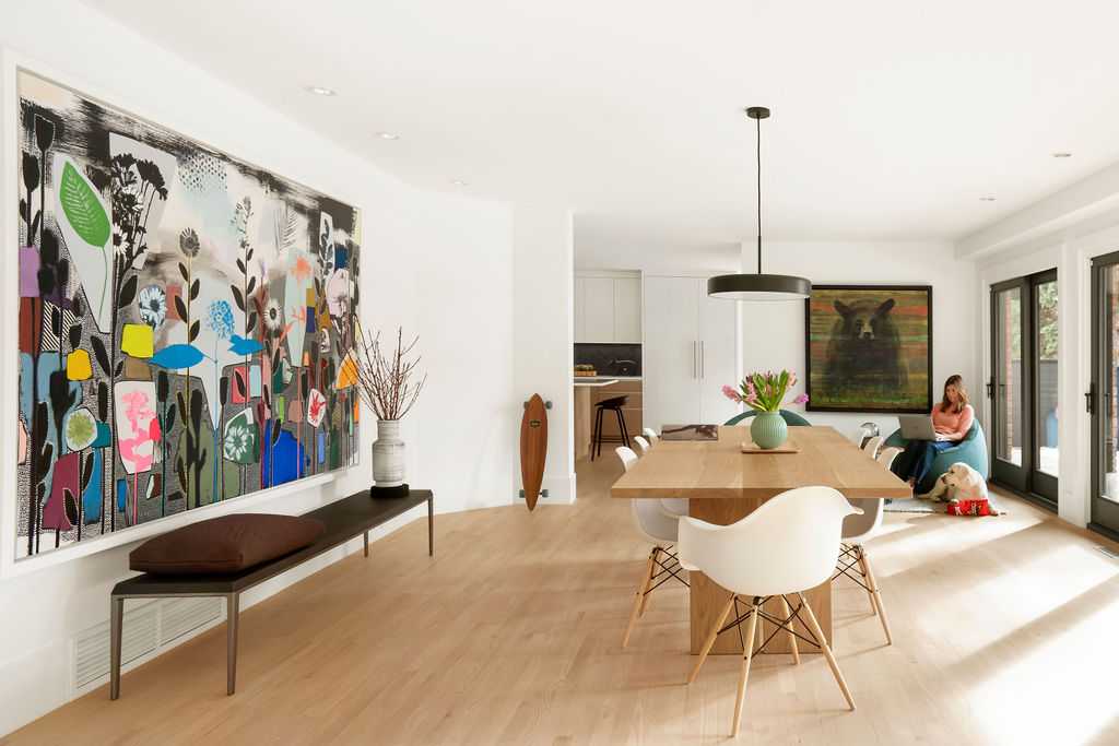
Main Floor Dining Room
Canadian art and natural light filled home, hallway perfect for longboarding and a bar to stop along the way. This 1960’s home went through a full renovation which took almost 3 years and has been meticulously executed by Waterford Homes.
The home has beautiful architecture, lots of wall space to create a true gallery experience, but the original finishes, functionality of the rooms and how they interacted needed some improvement. The shag carpet in the bathrooms and dark, segregated kitchen were much too 1960’s.
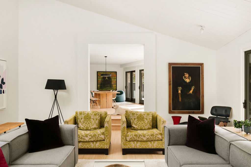
Main Floor Living Room
These particular clients have a true passion for Canadian art and well-designed homes. Before purchasing this home, they used to drive by it admiring the privacy and low-key aspect to this home. They never would have guessed that the bungalow with a conservative brick exterior had soaring ceilings, incredible angles and so much room for art. Built in 1985, the original owners modelled the home after their mid-century home in Palm Springs. The home has mid-century vibes with a sunken living room, sloped roof lines and distinctive architecture.

Design has been updated to “elevated” mid-century, timeless with the emphasis on never fancy but just fun. This particular painting was inherited from client’s French aunt and shipped to Calgary a few years ago.
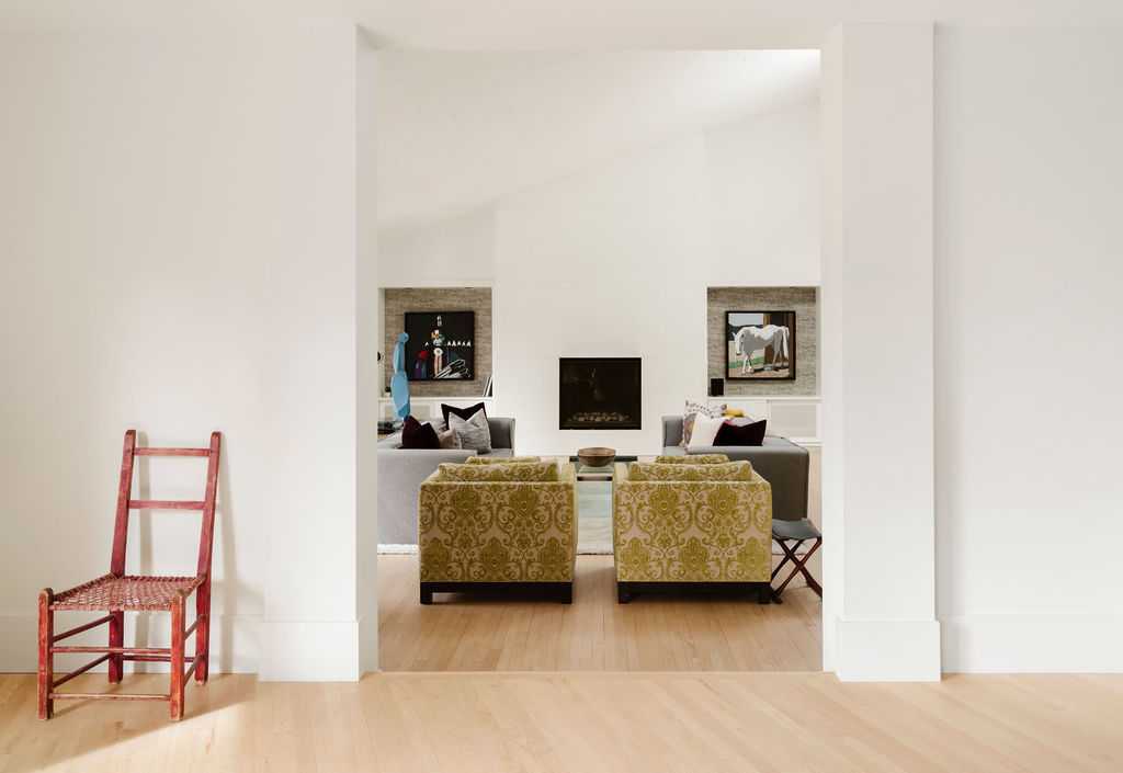
Dining Room into the Living Room
Client’s favourite pieces are from younger members of the family, their children age 14 and 15. As clients said to me: “If there was ever a fire, the only things we’d grab in the house would be their kid’s art”. Just like the rest the home’s collection, kids focused on Canadian art. First piece was of the children’s godfather’s horse named Blue, standing by his barn in Priddis, Alberta. The other piece was inspired by an Indigenous Chief.
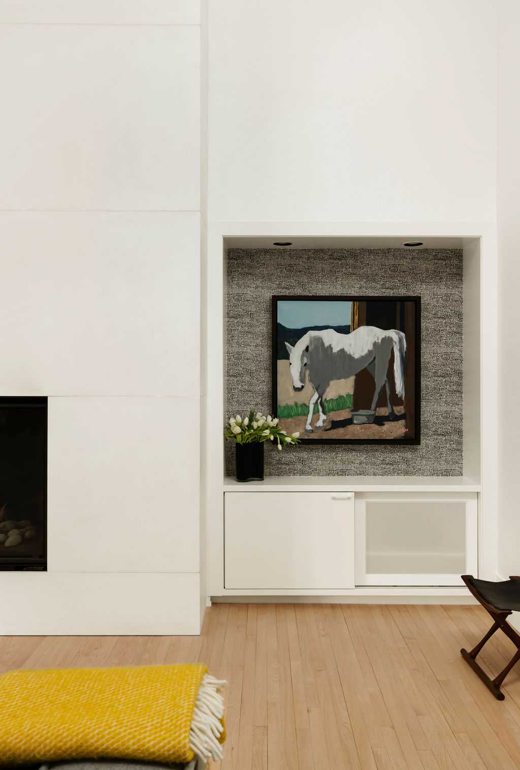
Art Nook
Smart storage for the speakers in the lower cabinet and art display above.
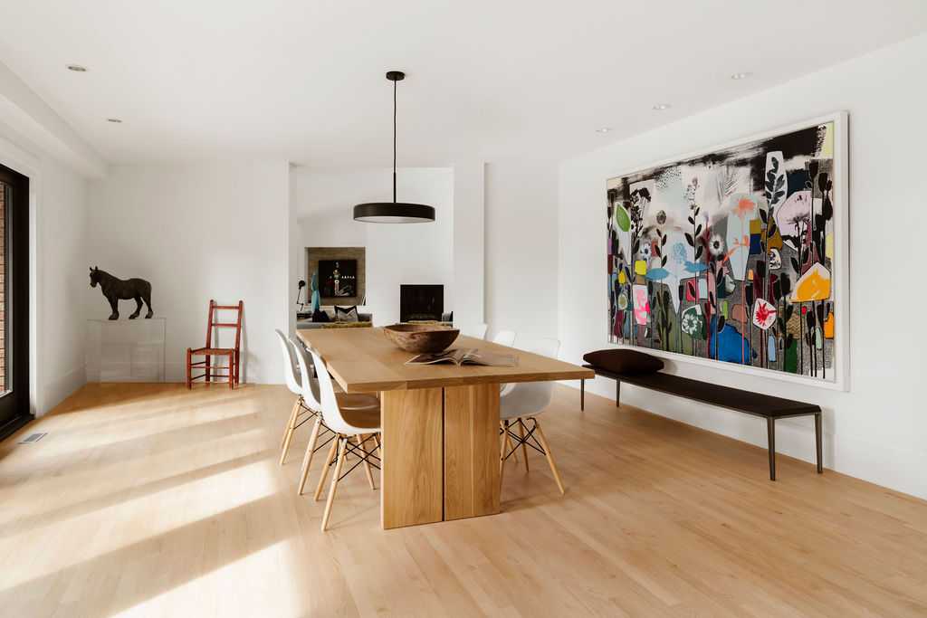
Dining Room
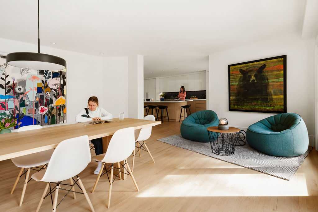
Dining Room
Dining Room opens into the kitchen with just enough of a separation but also allowing lots of interaction. This space definitely gets a lot of use between meals, puzzles, parties, homework and catching up on some work. The best seats in the house are in a cozy, sunny corner of the dining room with two ligne roset ottoman chairs. You are sure to find at least one member of the family enjoying it, including the beloved dog Eddie.
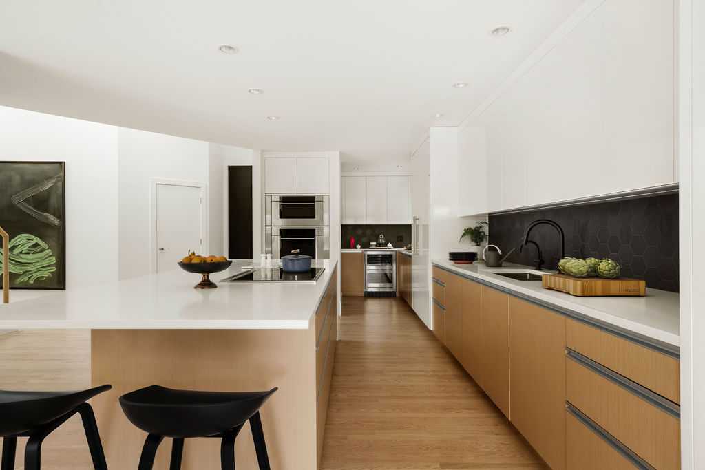
Kitchen
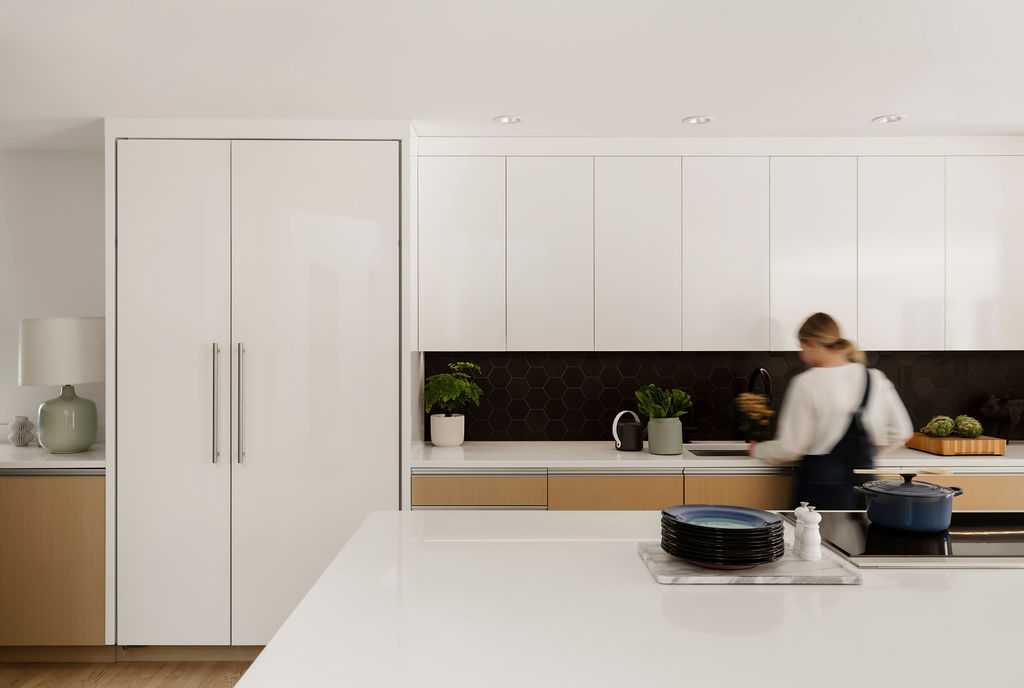
Kitchen used to be a dark and segregated space, very much separated from the rest of the house. By re-working the existing foot print, the kitchen became a bright, very organized and functional area of the home.
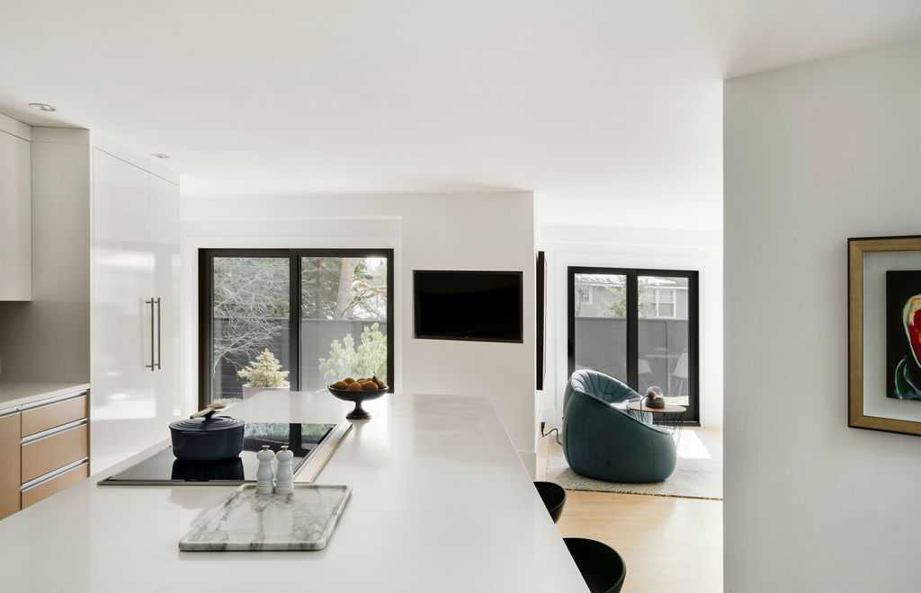
Kitchen
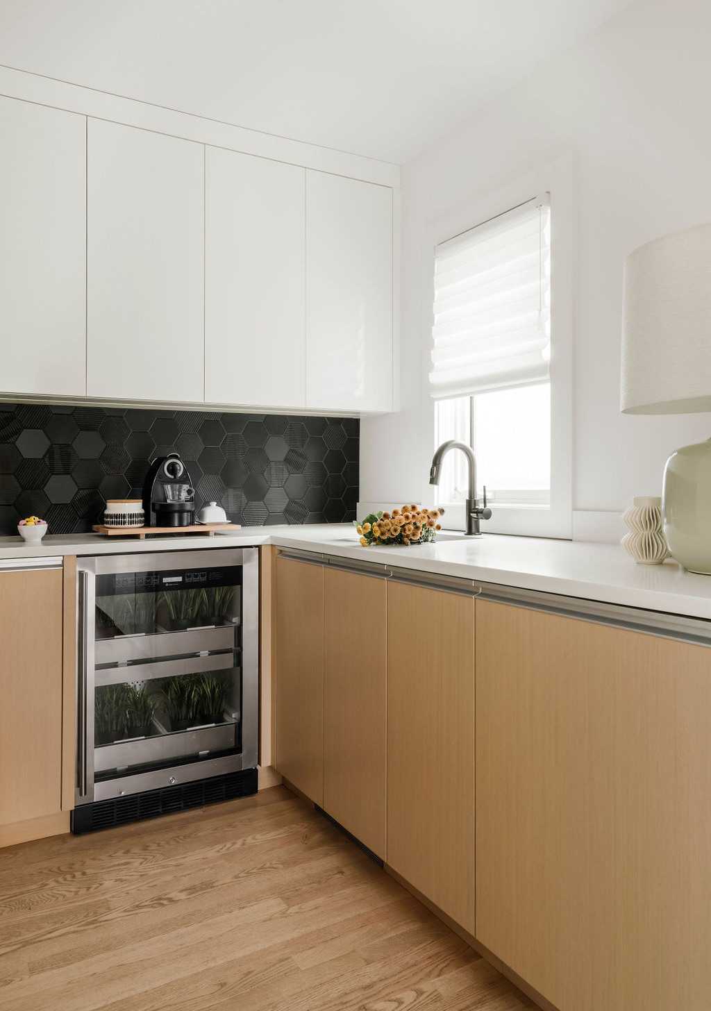
Large windows were added to the kitchen in the area that used to be a dark pantry.
Kitchen
Clients wanted to keep the kitchen very simple and sleek in regards to finishes, but found the black hexagon tile to add texture and dimension.
Kitchen
Kitchen
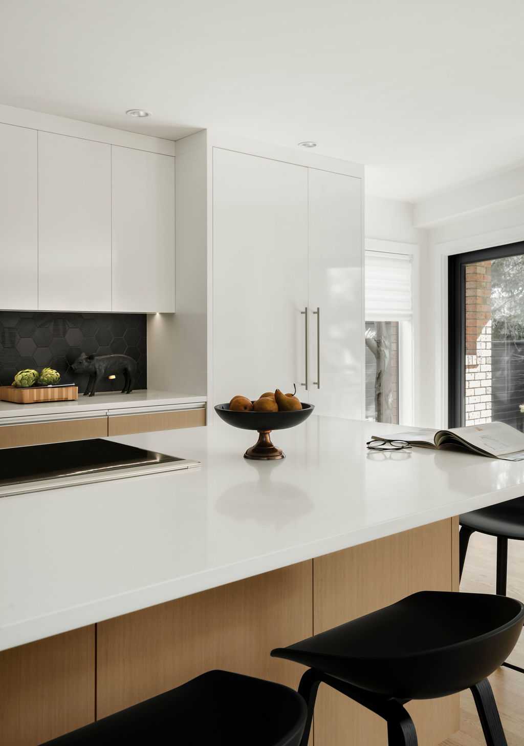
Clients wanted to keep the kitchen very simple and sleek in regards to finishes, but found the black hexagon tile to add texture and dimension.
Hallway & Bar
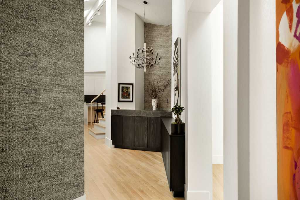
The home feels light, airy and fun - not precious. With kids often skateboarding the halls or party guests fill the hall with their party hats on. Art serves as a perfect backdrop.
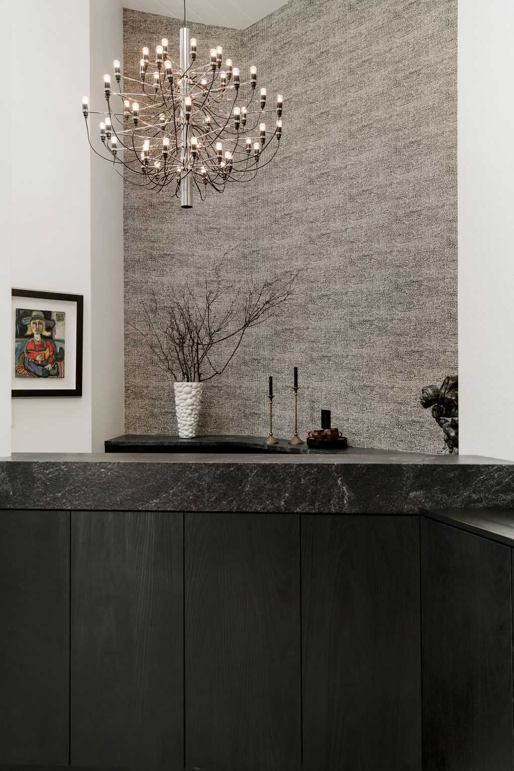
Bar
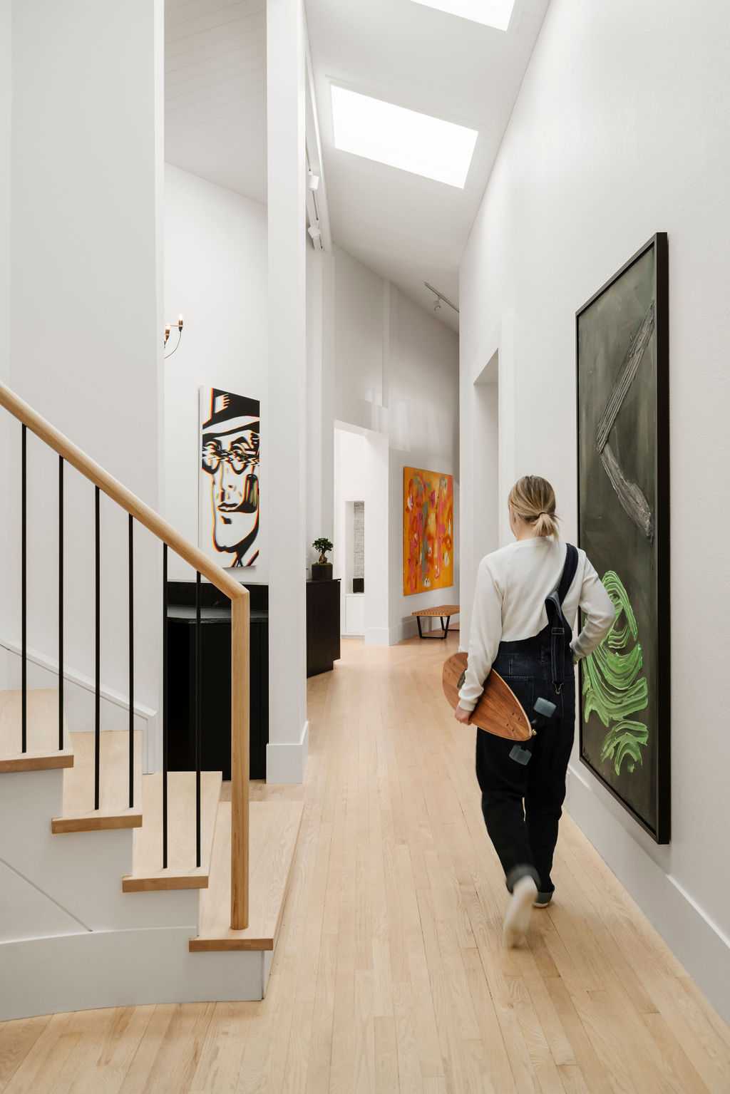
Hallway
Clients have broken many glasses in the bar, and dinged up the halls with volleyballs, skateboards and typical kid shenanigans. This house is very them – it has a sense of strong, refined but evolving style and taking anything too seriously.
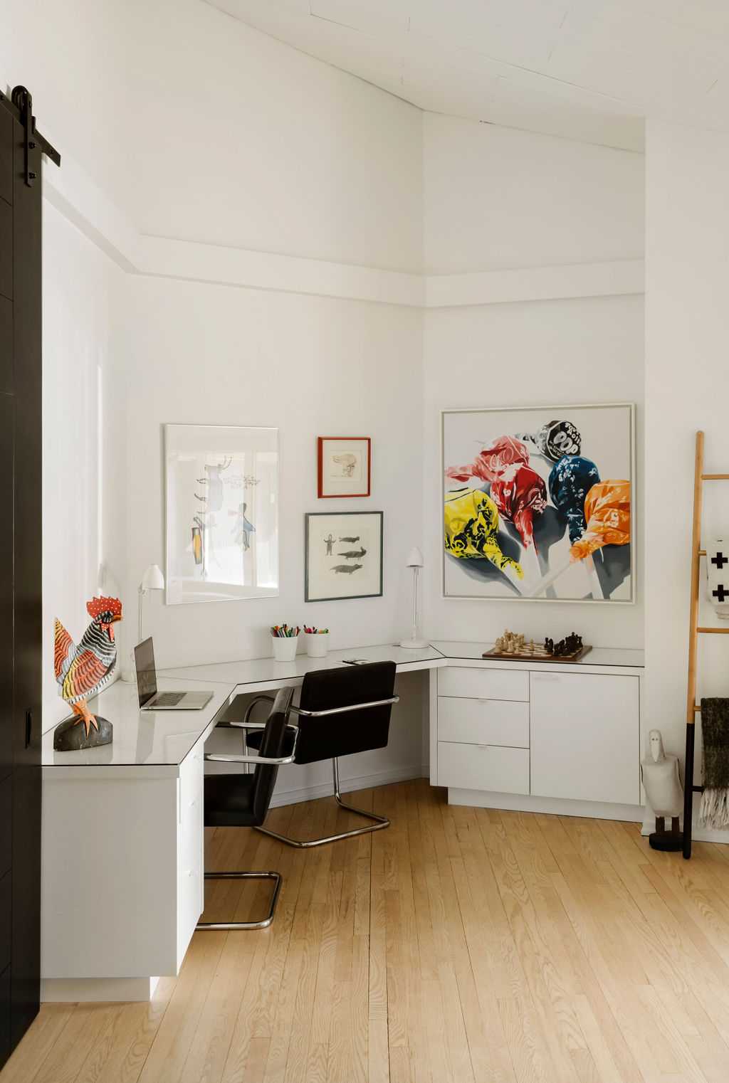
Office
Office is filled with art for inspiration and desk space for kids and adults to share.
Primary Bedroom Hallway is lined with thoughtfully organized, custom, rift cut oak wardrobe closets.
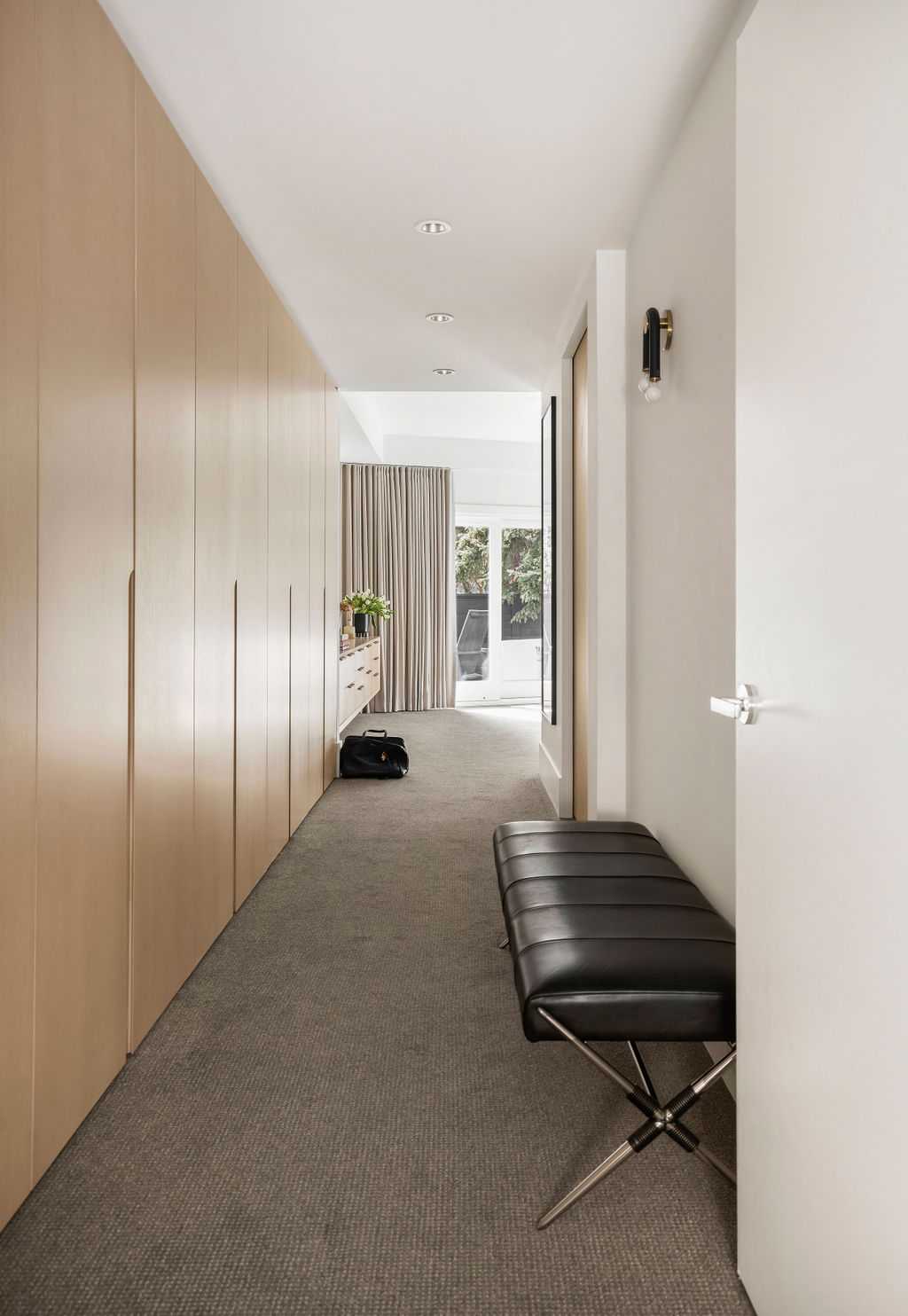
Primary Bedroom Hallway
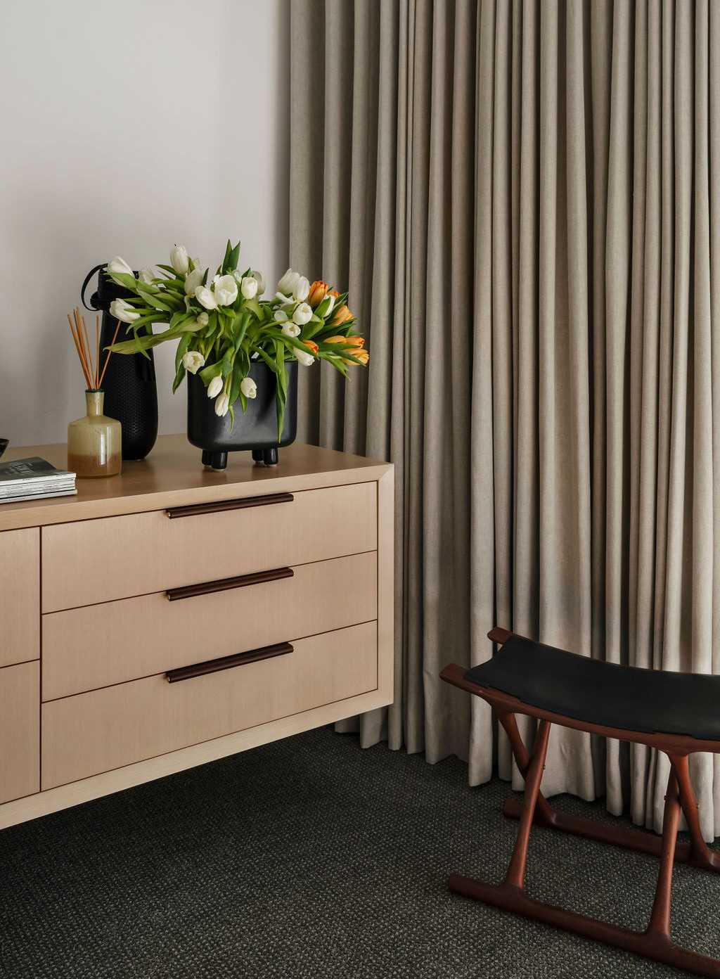
Custom Millwork
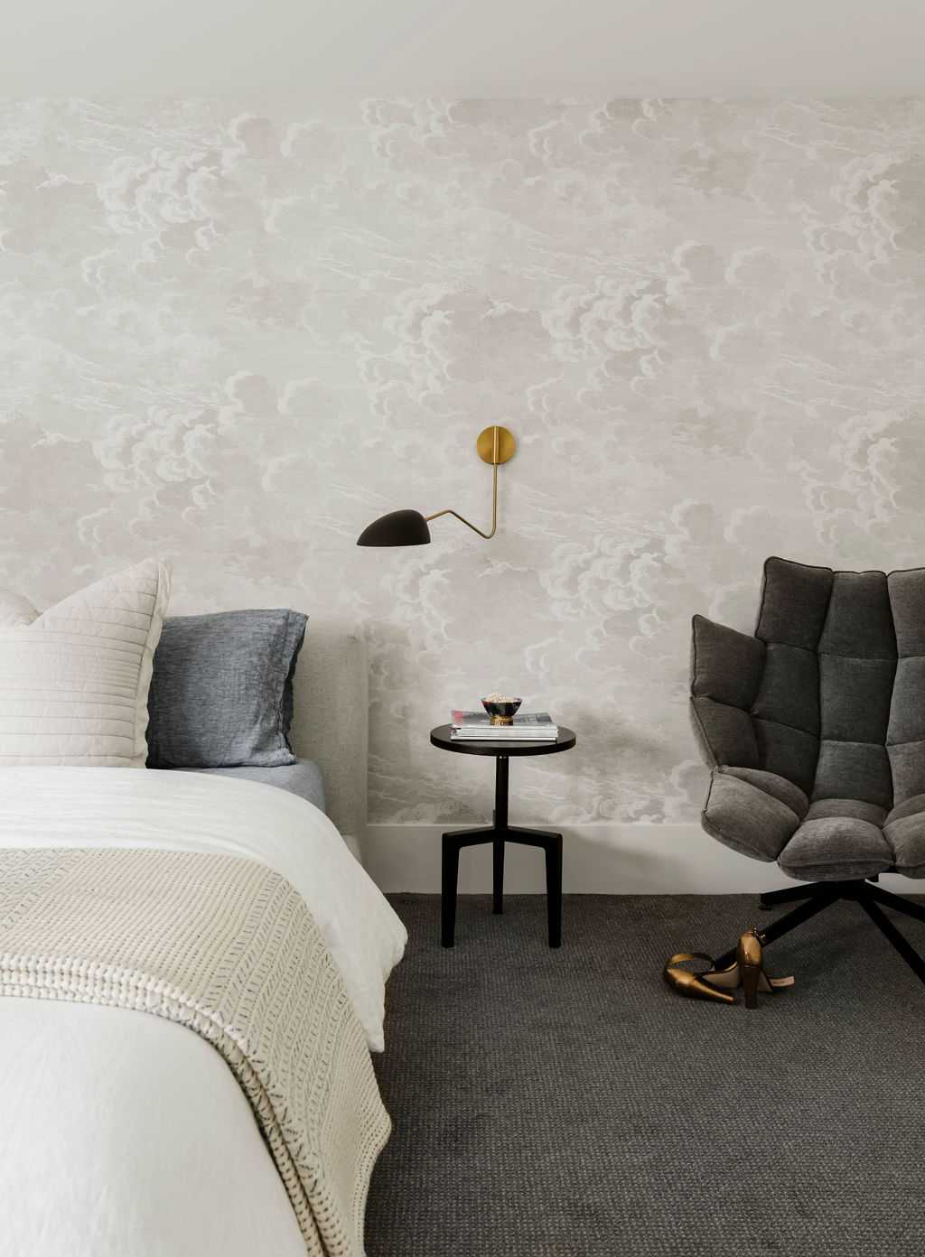
Primary Bedroom
Custom details can be seen throughout the primary bedroom from millwork, drapery to furnishings and wallcoverings.

Another area of this home to go through a major transformation is the Ensuite bathroom. Filled with natural light from the skylights to custom millwork, stone, walk in shower for two with mood lighting and seamless flooring. Mix of finishes have been introduced along with layered lighting to create functionality, interest and ambiance.
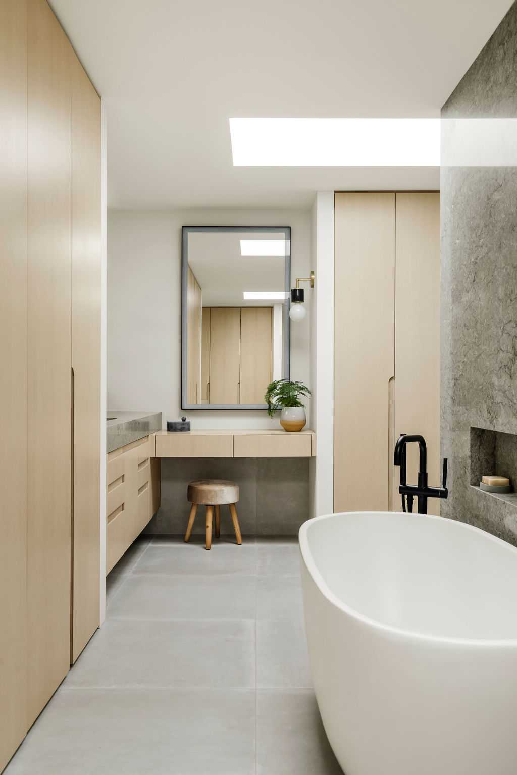
Ensuite
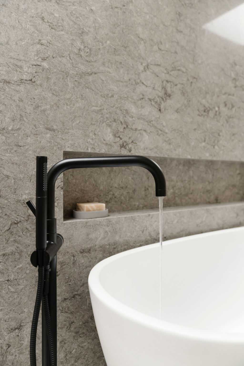
Details
Shower wall is shared with free standing tub on the other side. Niches were created on both sides for storage and dimension.
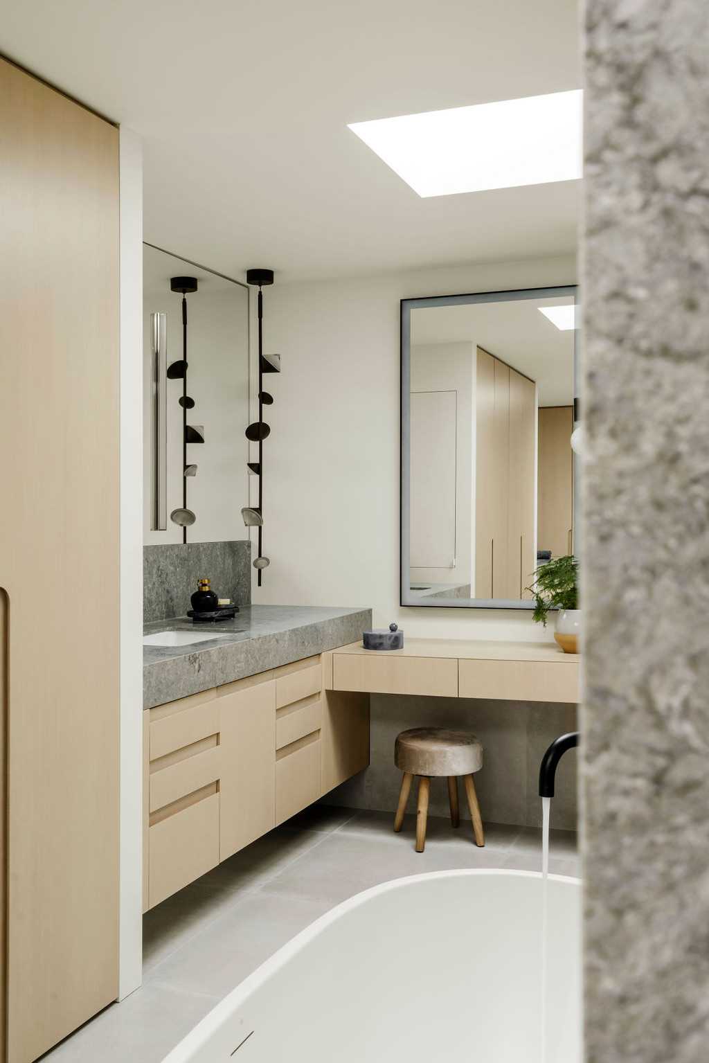
Her Side - Ensuite
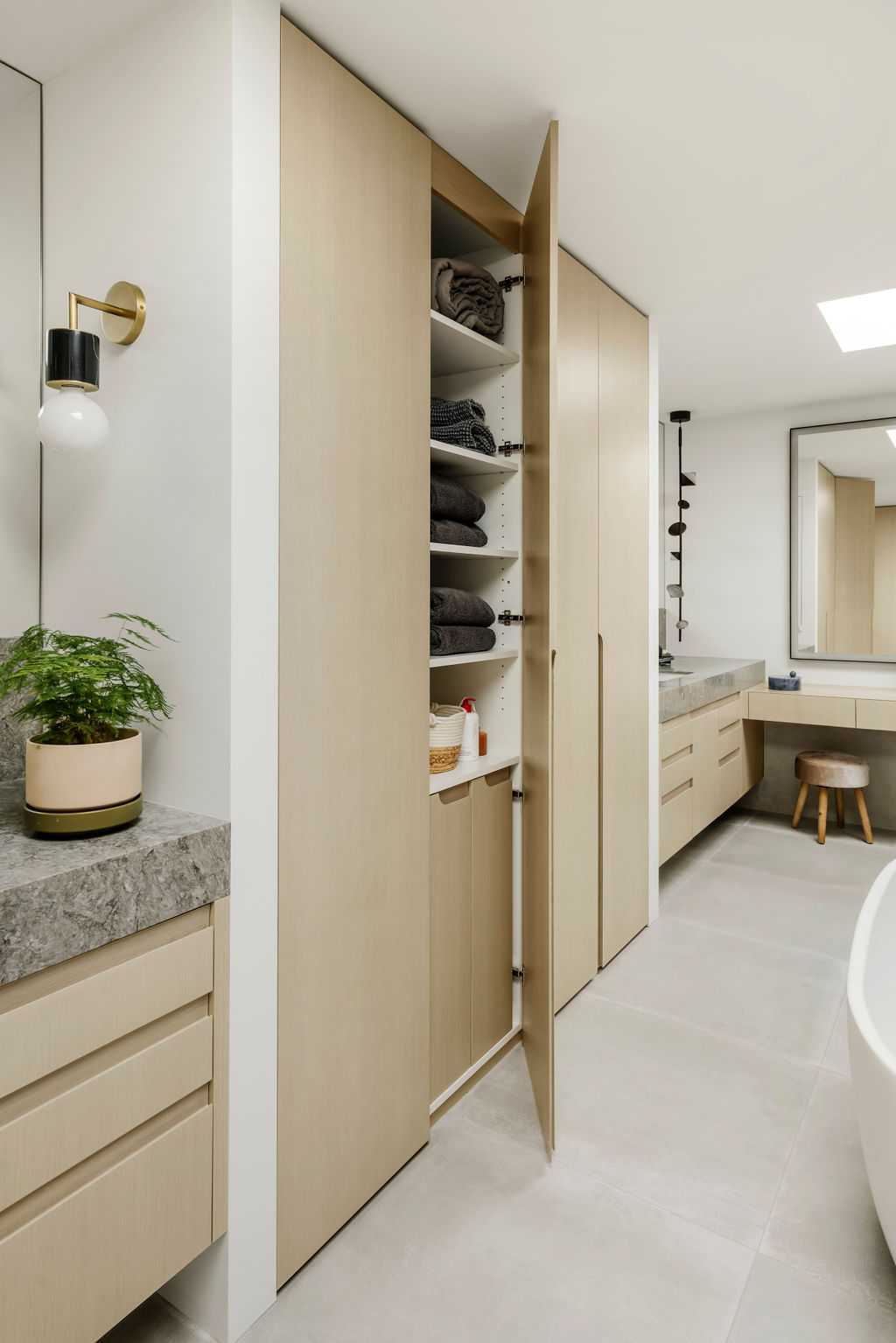
Ensuite - Storage
Plenty of custom wardrobe closet space has been designed for both his and her side - make up vanity, laundry hampers, storage for towels , linens, toiletries and extra clothing.
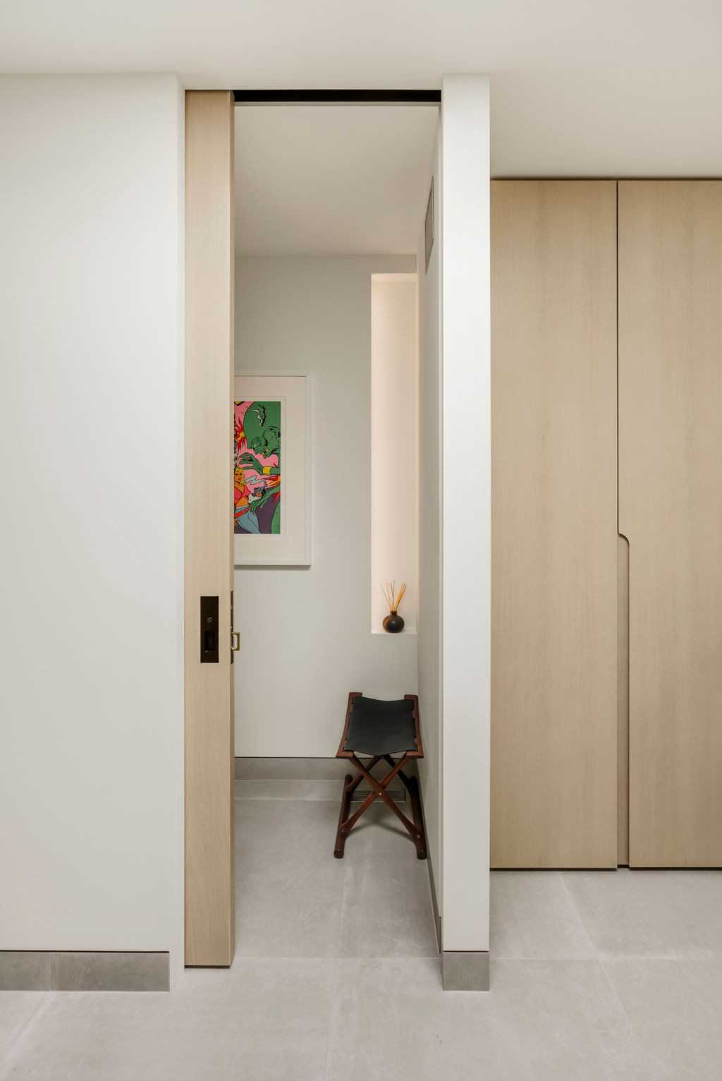
Entry into the Watercloset
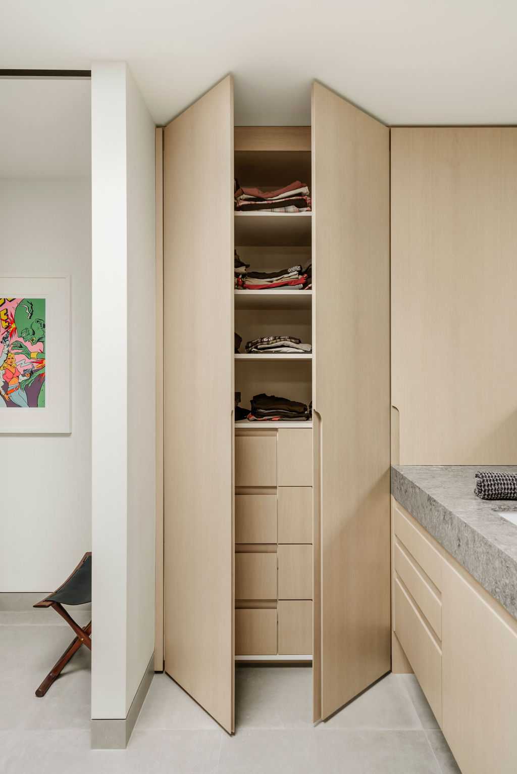
Custom Wardrobe
Every detail has been considered in this space, including seamless pocket doors, hardware, flush baseboards and heated, curb less floors.
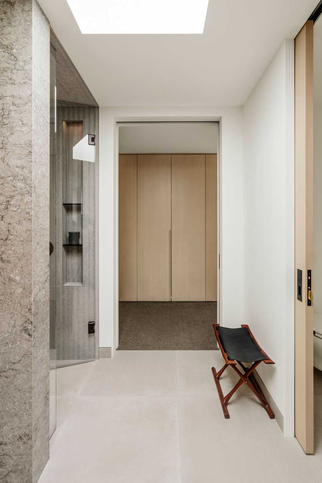
Bathroom Hallway
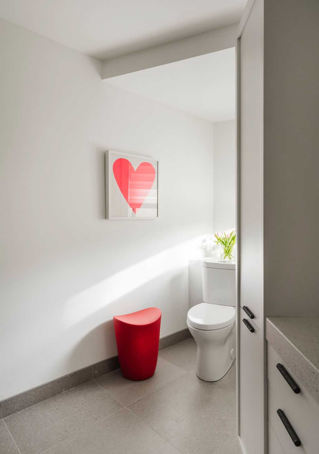
Kids Bathroom - Hers
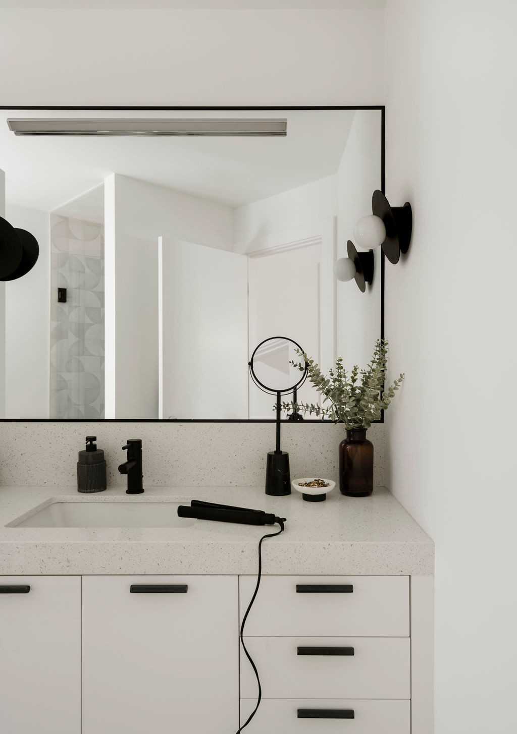
Kids Bathroom - Hers
Both kids wanted their bathrooms to be unique to them. Monochromatic for the girl with splashes of color and warmer wood tones for the boy. To keep the design elements fluid between the two bathrooms the same lighting and hardware was used.
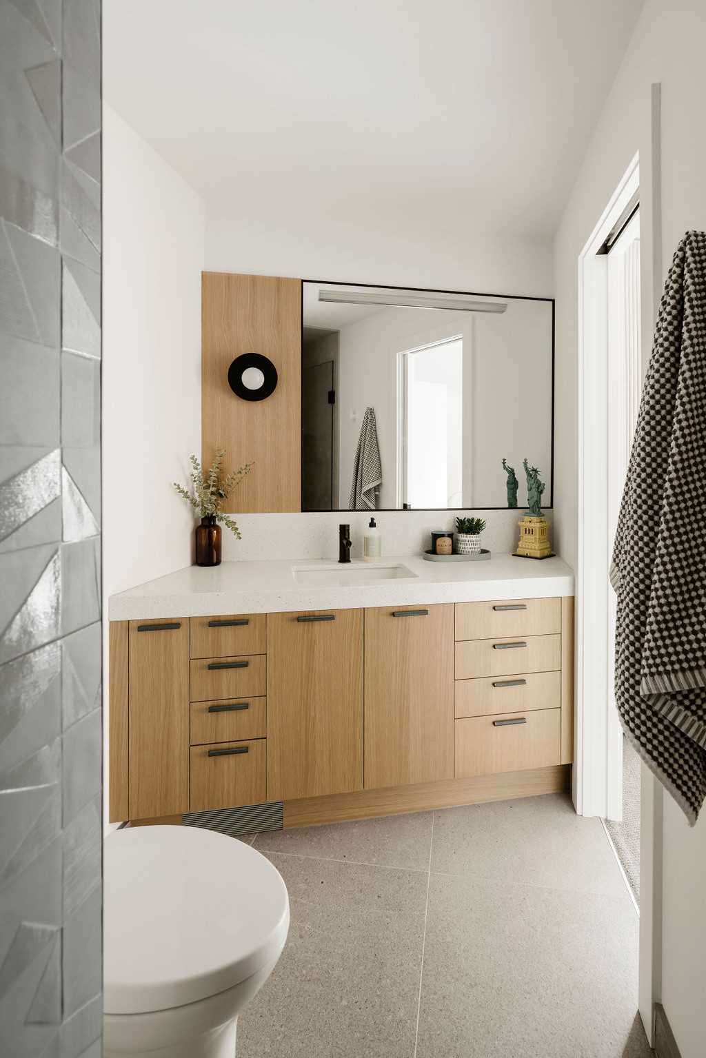
Kids Bathroom - His
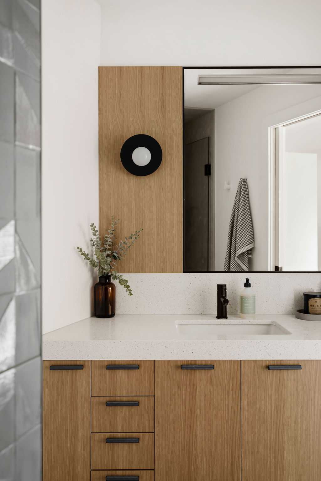
Kids Bathroom - His
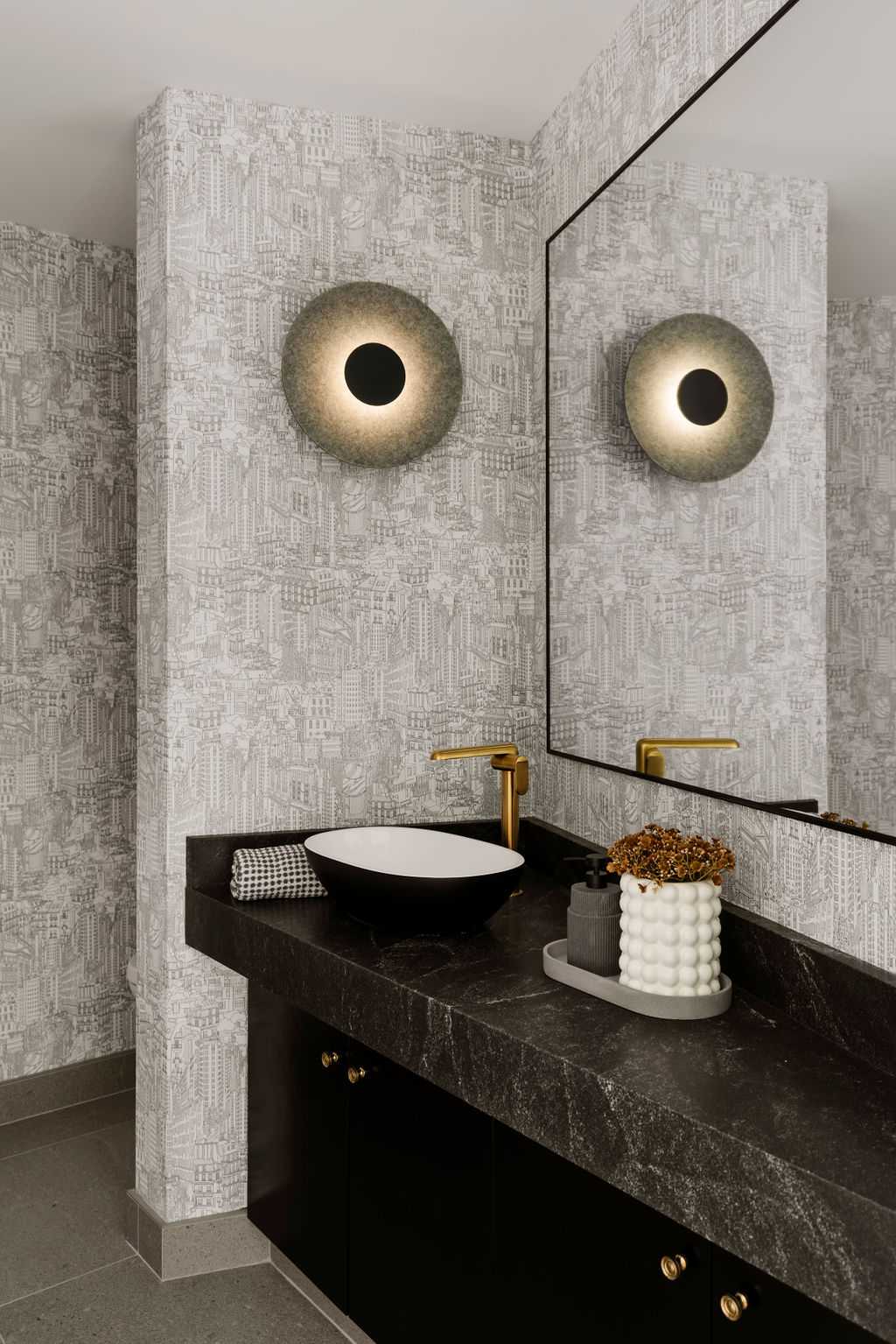
Powder Room
Design has been updated to “elevated” mid-century, timeless with the emphasis on never fancy but just fun. This particular painting was inherited from client’s French aunt and shipped to Calgary a few years ago.